The internet has traveled a long way, fairly quickly. The time period of just ten years back in the Internet world is like a century ago. In the domain of the Internet, technologies change and evolution occurs in a very noticeable and quick manner.
On top of that, the Internet has left its past far away, with the determination to never look back again. This is particularly true with web designing. The web is no longer accessed just through desktop computers. A great number of users access the web through a whole new family of small-screen devices like Smartphones and Tablets.
This did not pose any problem when the web was accessed only via desktop PCs. But with the inventions of small-screen devices, it became problematic. Because of the variations in resolution, web design is not inherently user-friendly. You have to pinch and zoom in to access your desired command if the web design is not responsive and adaptive and when you open a site on a smaller screen, which is primarily designed for the bigger screen, you notice that it all gets messy and it takes up a shape which won’t work and there’s no chance that you will want to stay on such site.
Because of this default-behavior, user-experience lacked being user-friendly. In other words, web pages were not responsive and flexible. They did not adapt according to their environment or devices but remained static.User-experience was not user-friendly and uniform across all devices.

Becoming Responsive
Ethan Marcotte coined the term “responsive web design” in 2010 in his A List Apart article. He combined three already existing techniques (flexible grid layout, flexible images/media, and media queries)
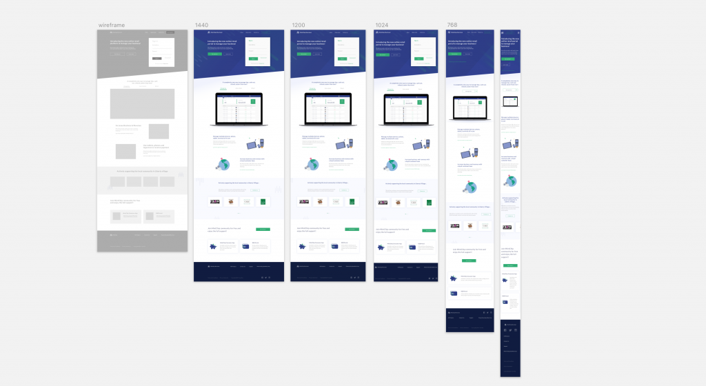
As you know, every device from desktops to smartphones to tablets, vary in their screen sizes and resolutions. Screen resolutions are of many sizes.
In simple terms Responsive Web Design is that design which should respond to the user’s environment based on screen size, platform, and orientation. A responsive website is perfectly aligned with each and every resolution.
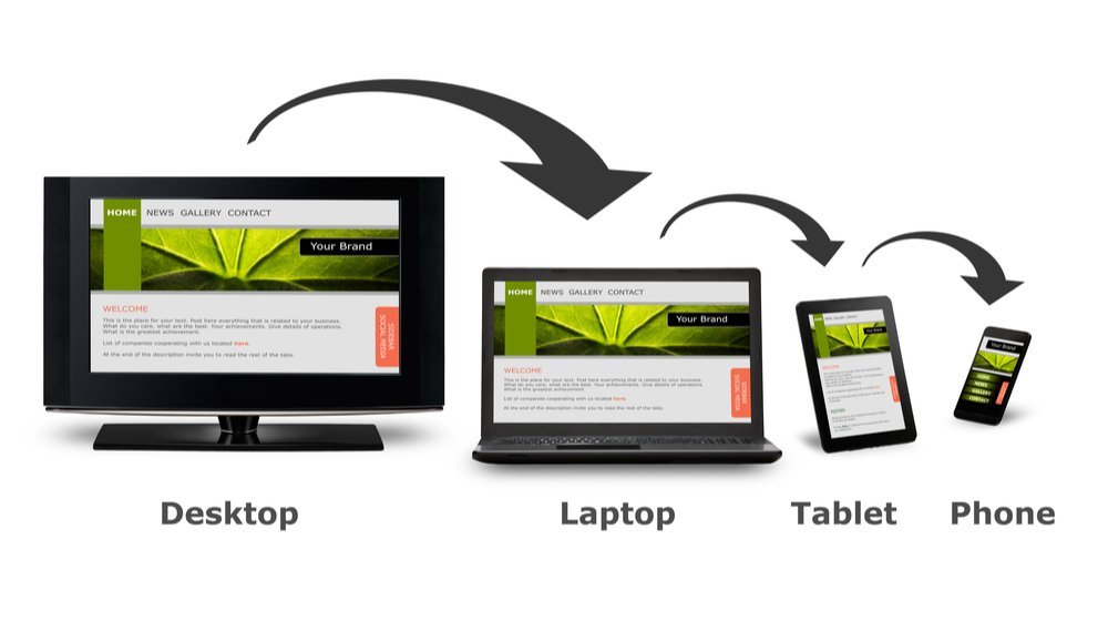
You can fully understand it with the following:
When you access a website through various types of small-screen devices and desktops, the responsive website is aligned according to the device, making your user-experience user-friendly.

In this figure, the right-hand side web page is in lesser resolution. Because the website is flexible and adaptive, it is perfectly aligned with the small-screen device. You don’t have to zoom in and pinch. Think of it as one experience that can be viewed flexibly on any size device, instead of being exclusive to one specific device experiences. Ultimately our purpose is not to design for devices but for people on the other side of those screens.
Ingredients of A Responsive Website
Flexible grid layouts, images, and media queries are the key ingredients of the design. The technologies already existed. However, Ethan united them under a single banner, as a result, the level of web design shifted to a whole new level and it significantly changed the way we think about web design.
The first main ingredient is flexible or fluid grid layouts which are two dimensional. It’s a layout that’s built with percentages and proportions rather than inflexible pixels.
Then there are flexible images and media themselves that are flexible and work with those flexible layouts.
Finally, we have media queries. They allow us to control flexibility in ways that are useful to us. We can change and adapt those fluid layouts at different points. In other words, they can respond to the changing shape of a browser window or of a device’s display.
Basically, we get a responsive website when these three snap together. It’s such a delicious recipe.
Rehman Technologies Creates For You The Optimal Responsive Websites
Don’t you hear complaints about your websites that it all gets funky when the visitors try to open the site from the smaller-screen devices? Wouldn’t you want to stop that!
Wait no more and solve this problem right away.
Rehman Technologies will design for you the optimal user-friendly responsive websites. Visitors will want to stay longer, wait no more and provide the best User-experience (UX).


