Corporate Identity is an umbrella term. It doesn’t carry just one thing with itself. It consists of two parts. The first one is your company’s visual elements such as logo, tagline, fonts, and colors. The second part is more idea-based. It’s what you stand for, the kinds of problems you want to solve with your products and services, the value you want to add, the hole you want to fill and the difference you want to make.
Both of these sides of the coin are equally important. You just can’t prefer one over the other. They have to go together. However, the logo and its design have a particularly special place in your brand because a logo is an image that symbolizes your business. Through logo, a customer has a very first impression of a company. So it must be catchy.
Not all logos are designed similarly. They can have text as the company’s name in them or they can just be a symbol. So let’s make it clear what kind of shapes logos and what their types are!

There are basically seven types of a logo:
Emblem Logos
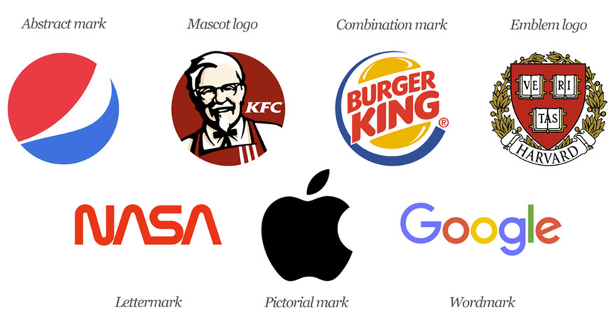
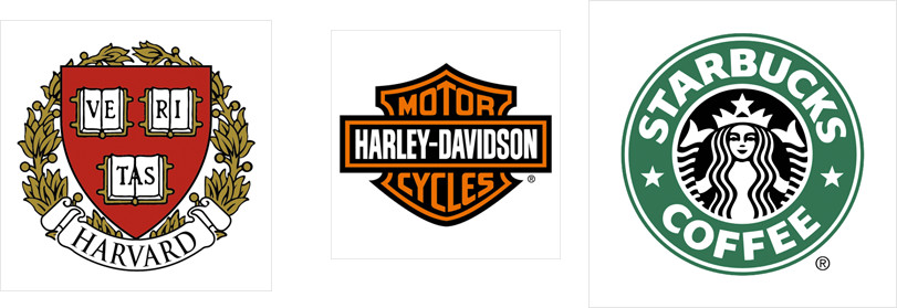
An emblem logo has the text of a company or organization inside a symbol or icon. They have been more traditional and classical types. They typically represent that a company or an organization has been there for a long time.

Monogram Logos (or Letter Marks)
This type of logo is just the name of your company. You design your company’s name as a logo. In this regard, you think that the name of your company is also significant. This logo is made when your company is relatively new and it carries a short name. You design this logo because you want to familiarize your company and make your company and its name famous.

Monogram Logos (or Letter Marks)
This type of logo is design with the initial letters of your company name. Since the name is too big, so you take initials and make a logo out of them. Like the logos of IBM (The International Business Machines Corporations) and HBO (House Box Office). These kinds of logos are designed when everybody knows the company. When they see their logo, they instantly know what company it is!

Pictorial Marks (or Logo Symbols)
This kind of logo is a symbol of a real thing. For example, the logo of the Apple company is the symbol of the apple itself. And the logo of Twitter Company is the symbol of the twitter bird itself.
Some of them are the iconic Apple logo, the Twitter bird, the Target bullseye.
These are literal symbols. This means they represent real, specific things. They sure communicate about the brand.

Abstract Logo Mark
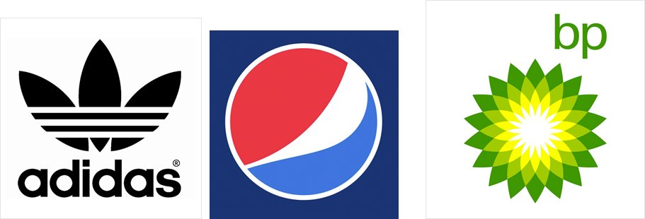
This type of logo is also a pictorial. But it’s not literal means it’s not directly connected with the brand name. It creates feelings though. It’s a symbol that represents your business. A few famous examples include the BP starburst logo, the Pepsi divided circle, and the strip Adidas flower.
Companies usually prefer this type of logo. And these company logos are more unique. Companies usually prefer this kind of logo.
New companies don’t just right away select an abstract logo mark. They also put the name of their company as Nike did. With their current symbol, they had a name written over it. They used this combo until they became absolutely famous. And they re-branded to just the symbol in their logo.

Mascots
It’s simply an illustrated character that represents your company. Famous mascots include the Kool-Aid Man, KFC’s Colonel and Planter’s Mr. Peanut. Mascots are a great way to appeal to families and children. Mascots carry a global symbol for your customers because it’s an illustrated character. Any customer anywhere in the world will relate the same meaning.
Let’s say the clown of McDonald’s. Kids love to get pictures with this clown. Mascots encourage more interaction. People even become more interested in the company. Say, for example, KFC’s Colonel. People want to more about Colonel that who this guy was and do some digging.

The Combination Mark
A Combination mark is the combination of a wordmark and a pictorial mark, abstract mark or mascot. Now the text can pass through the symbol like that of Doritos, inside the symbol like that of Burger King and stacked on top of each other like Amazon. This creates a more distinct image.

Rehman Technologies Brings Solutions Of Your Problems
So you are sick of dull logo designs. And want your customer to never forget your brand identity. And want to attract your customer with a glowing logo.
Now is the chance to engrain your identity in the minds of customers. Rehman Technologies will design professional and catchy logos. Your brand identity will now be all-known because we design all kinds of perfectly fit logos.


